[et_pb_section fb_built=”1″ _builder_version=”3.0.47″][et_pb_row _builder_version=”3.0.48″ background_size=”initial” background_position=”top_left” background_repeat=”repeat”][et_pb_column type=”4_4″ _builder_version=”3.0.47″ parallax=”off” parallax_method=”on”][et_pb_text _builder_version=”3.0.74″ background_size=”initial” background_position=”top_left” background_repeat=”repeat”]
CSS Shapes allow us to make interesting and unique layouts by defining geometric shapes, images, and gradients that text content can flow around.
Until the introduction of CSS Shapes, it was nearly impossible to design a magazine-esque layout with free flowing text for the web. On the contrary, web design layouts have traditionally been shaped with grids, boxes, and straight lines.
CSS Shapes allow us to define geometric shapes that text can flow around. These shapes can be circles, ellipses, simple or complex polygons, and even images and gradients. A few practical design applications of Shapes might be displaying circular text around a circular avatar, displaying text over the simple part of a full-width background image, and displaying text flowing around drop caps in an article.
Now that CSS Shapes have gained widespread support across modern browsers, it’s worth taking a look into the flexibility and functionality they provide to see if they might make sense in your next design project.
First Look at CSS Shapes
The current implementation of CSS Shapes is CSS Shapes Module Level 1, which mostly revolves around the shape-outside property. shape-outside defines a shape that text can flow around.
Considering there is a shape-outside property, you might assume there is a corresponding shape-inside property that would contain text within a shape. A shape-inside property might become a reality in the future, but it is currently a draft in CSS Shapes Module Level 2, and is not implemented by any browser.
In this article, we’re going to demonstrate how to use the <basic-shape> data type and set it with shape function values, as well as setting a shape using a semi-transparent URL or gradient.
Basic Shape Functions
We can define all sorts of Basic Shapes in CSS by applying the following function values to the shape-outside property:
circle()ellipse()inset()polygon()
In order to apply the shape-outside property to an element, the element must be floated, and have a defined height and width. Let’s go through each of the four basic shapes and demonstrate how they can be used.
Circle
We’ll start with the circle() function. Imagine a situation in which we have a circular avatar of an author that we want to float left, and we want the author’s description text to flow around it. Simply using a border-radius: 50% on the avatar element won’t be enough to get the text to make a circular shape; the text will still treat the avatar as a rectangular element.
With the circle shape, we can demonstrate how text can flow around a circle.
We’ll start by creating a circle class on a regular div, and making some paragraphs. (I used Bob Ross quotes as Lorem Ipsum text.)
<div class="circle"></div>
<p>Example text...</p>
In our circle class, we float the element left, give it an equal height and width, and set the shape-outside to circle().
.circle {
  float: left;
  height: 200px;
  width: 200px;
  shape-outside: circle();
}
If we view the page, it will look like this.

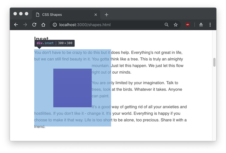
As you can see, the text flows around the circle shape, but we don’t actually see any shape. Hovering over the element in Developer Tools will show us the actual shape that is being set.
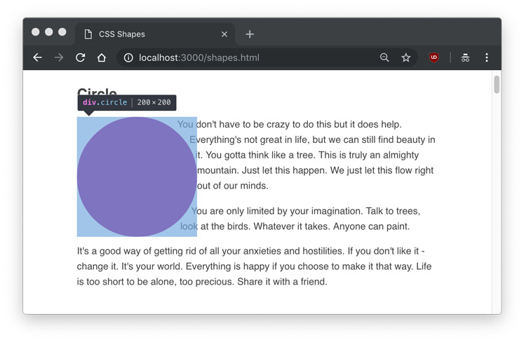
At this point, you might assume that you can set a background color or image to the element, and you’ll see the shape. Let’s try that out.
.circle {
  float: left;
  height: 200px;
  width: 200px;
  shape-outside: circle();
  background: linear-gradient(to top right, #FDB171, #FD987D);
}
Frustratingly, setting a background to the circle just gives us a rectangle, the very thing we’ve been trying to avoid.
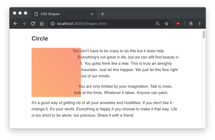
We can clearly see the text flowing around it, yet the element itself doesn’t have a shape. If we want to actually display our shape functions, we’ll have to use the clip-path property. clip-path takes many of the same values as shape-outside, so we can give it the same circle() value.
.circle {
  float: left;
  height: 200px;
  width: 200px;
  shape-outside: circle();
  clip-path: circle();
  background: linear-gradient(to top right, #FDB171, #FD987D);
}
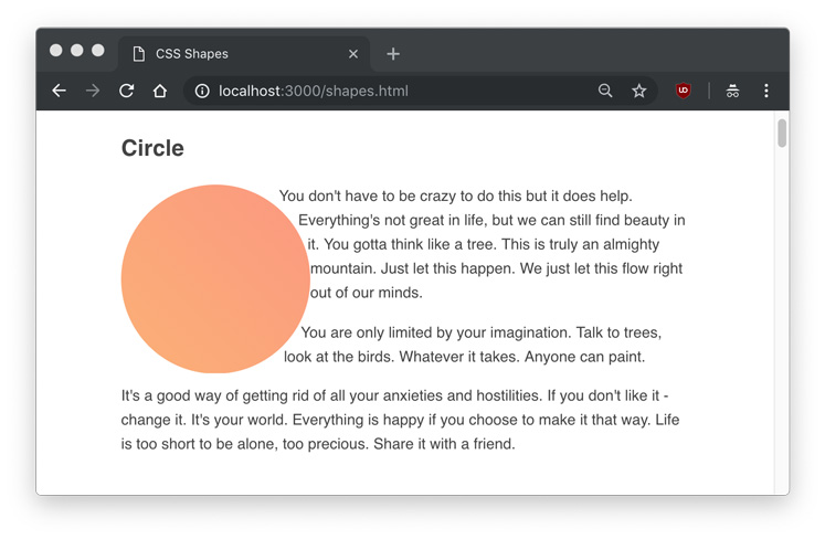
The circle() function takes an optional parameter of radius. In our case, the default radius (r) is 50%, or 100px. Using circle(50%) or circle(100px) would produce the same result as what we’ve already done.
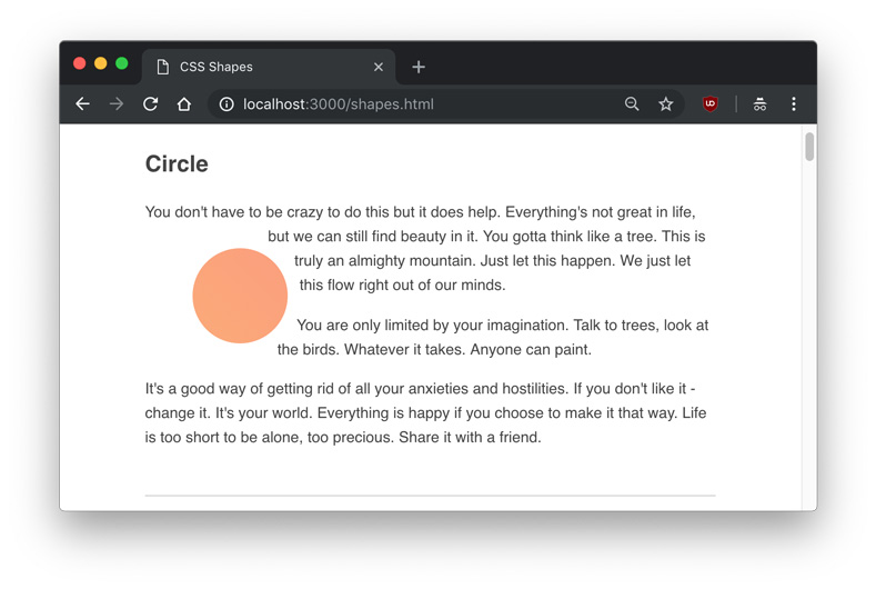
You might notice the text is right up against the shape. We can use the shape-margin property to add a margin to the shape, which can be set in px, em, %, and any other standard CSS unit of measurement.
.circle {
  float: left;
  height: 200px;
  width: 200px;
  shape-outside: circle(25%);
  shape-margin: 1rem;
  clip-path: circle(25%);
  background: linear-gradient(to top right, #FDB171, #FD987D);
}
Here is an example of a 25% circle() radius with a shape-margin applied.
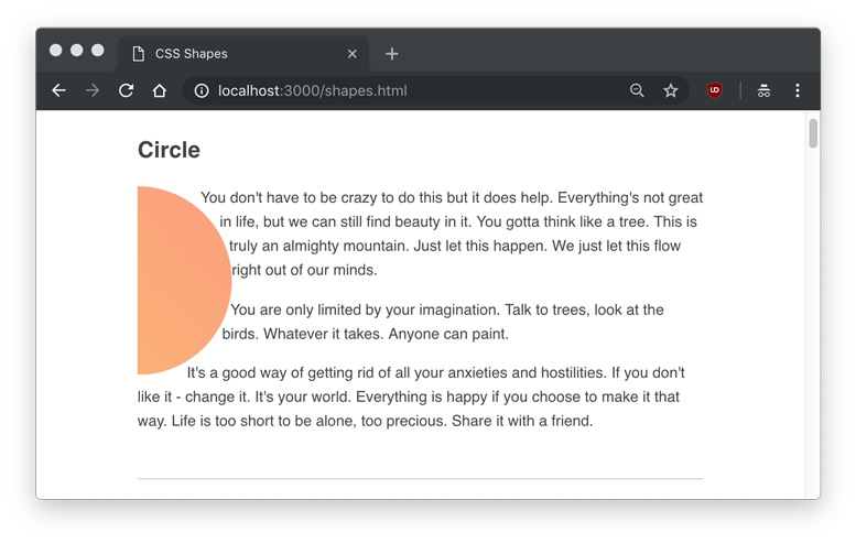
In addition to the radius, a shape function can take a position using at. The default position is the center of the circle, so circle() would explicitly be written as circle(50% at 50% 50%) or circle(100px at 100px 100px), with the two values being the horizontal and vertical positions, respectively.
To make it obvious how the positioning works, we could set the horizontal position value to 0 to make a perfect semi-circle.
circle(50% at 0 50%);This coordinate positioning system is known as the reference box.
Ellipse
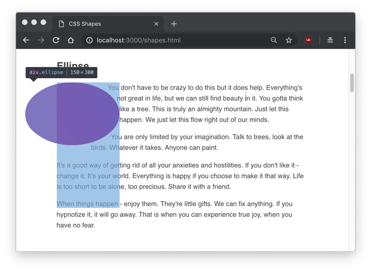
Similar to the circle() function is the ellipse(), which creates an oval. To demonstrate, we can create an ellipse element and class.
<div class="ellipse"></div>
<p>Example text...</p>
.ellipse {
float: left;
shape-outside: ellipse();
clip-path: ellipse();
width: 150px;
height: 300px;
background: linear-gradient(to top right, #F17BB7, #AD84E3);
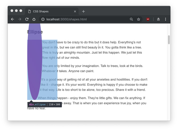
}This time, we set a different height and width to make a vertically elongated oval.
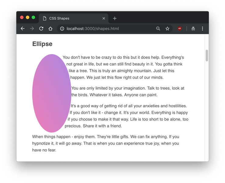
The difference between an ellipse() and a circle() is that an ellipse has two radii – rx and ry, or the X-axis radius and Y-axis radius. Therefore, the above example can also be written as:
ellipse(75px 150px);The position parameters are the same for circles and ellipses. The radii, in addition to being a unit of measurement, also include the options of farthest-side and closest-side.
closest-side refers to the length from the center to closest side of the reference box, and conversely, farthest-side refers to the length from the center to the farthest side of the reference box. This means that these two values have no effect if a position other than default isn’t set.
Here is a demonstration of the difference of flipping closest-side and farthest-side on an ellipse() with a 25% offset on the X and Y axes.
ellipse(farthest-side closest-side at 25% 25%)
ellipse(farthest-side closest-side at 25% 25%)
Inset
So far we’ve been only been dealing with round shapes, but we can define inset rectangles with the inset() function.
<div class="inset"></div>
<p>Example text...</p>
.inset {
float: left;
shape-outside: inset(75px);
clip-path: inset(75px);
width: 300px;
height: 300px;
background: linear-gradient(#58C2ED, #1B85DC);
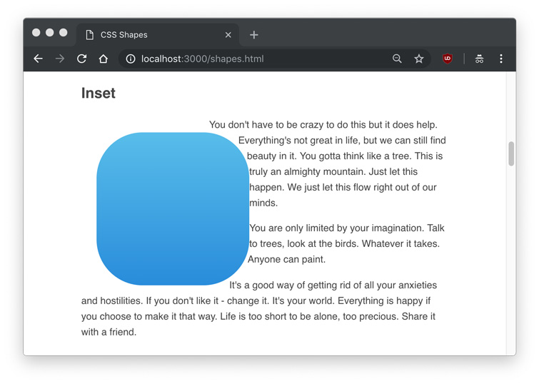
}In this example, we’ll create a 300px by 300px rectangle, and inset it by 75px on all sides. This will leave us with a 150px by 150px with 75px of space around it.
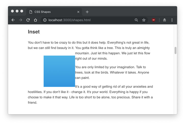
We can see that the rectangle is inset, and the text ignores the inset area.
An inset() shape can also take a border-radius with the round parameter, and the text will respect the rounded corners, such as this example with a 25px on all sides and 75px rounding.
inset(25px round 75px)
Like padding or margin shorthand, the inset value will accept top right bottom left values in clockwise order (inset(25px 25px 25px 25px)), and only using a single value will make all four sides the same (inset(25px)).
Polygon
The most interesting and flexible of the shape functions is the polygon(), which can take an array of xand y points to make any complex shape. Each item in the array represents xi yi, and would be written as polygon(x1 y1, x2 y2, x3 y3...) and so on.
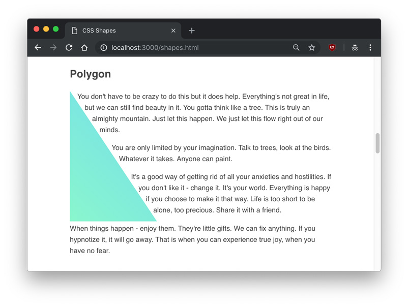
The fewest amount of point sets we can apply to a polygon is three, which will create a triangle.
<div class="polygon"></div>
<p>Example text...</p>
.polygon {
float: left;
shape-outside: polygon(0 0, 0 300px, 200px 300px);
clip-path: polygon(0 0, 0 300px, 200px 300px);
height: 300px;
width: 300px;
background: linear-gradient(to top right, #86F7CC, #67D7F5);
}In this shape, the first point is 0 0, the top left most point in the div. The second point is 0 300px, which is the bottom left most point in the div. The third and final point is 200px 300px, which is 2/3rd across the X axis and still at the bottom. The resulting shape looks like this:
An interesting usage of the polygon() shape function is that text content can flow between two or more shapes. Since the polygon() shape is so flexible and dynamic, this is one of the biggest opportunities to make truly unique, magazine-esque layouts. In this example, we’ll put some text between two polygon shapes.
<div class="left"></div>
<div class="right"></div>
<p>Example text...</p>
.left {
float: left;
shape-outside: polygon(0 0, 0 300px, 200px 300px);
clip-path: polygon(0 0, 0 300px, 200px 300px);
background: linear-gradient(to top right, #67D7F5, #86F7CC);
height: 300px;
width: 300px;
}
.right {
float: right;
shape-outside: polygon(200px 300px, 300px 300px, 300px 0, 0 0);
clip-path: polygon(200px 300px, 300px 300px, 300px 0, 0 0);
background: linear-gradient(to bottom left, #67D7F5, #86F7CC);
height: 300px;
width: 300px;
} 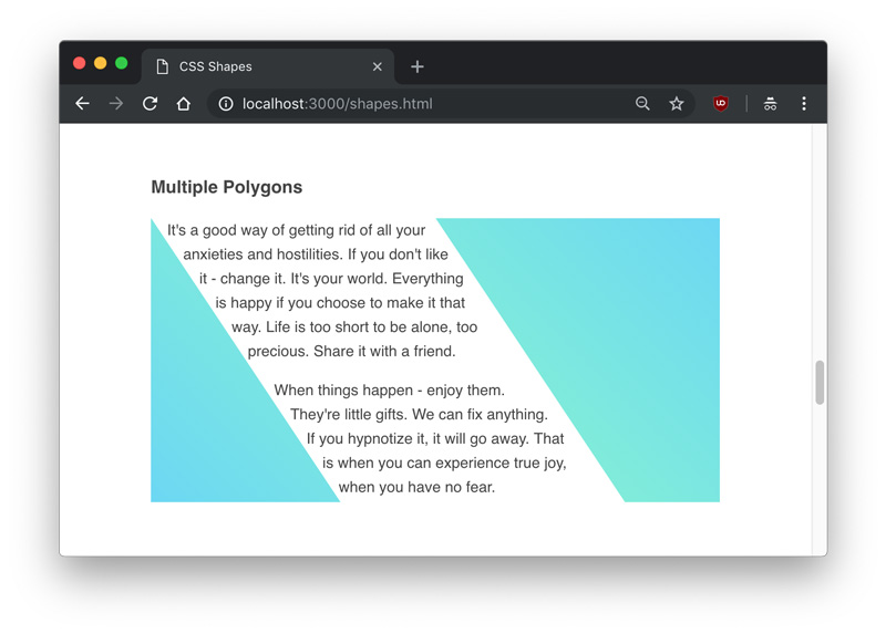 Obviously, it would be very difficult to try to create your own complex shapes manually. Fortunately, there are several tools you can use to create polygons. Firefox has a built in editor for shapes, which you can use by clicking on the polygon shape in the Inspector.
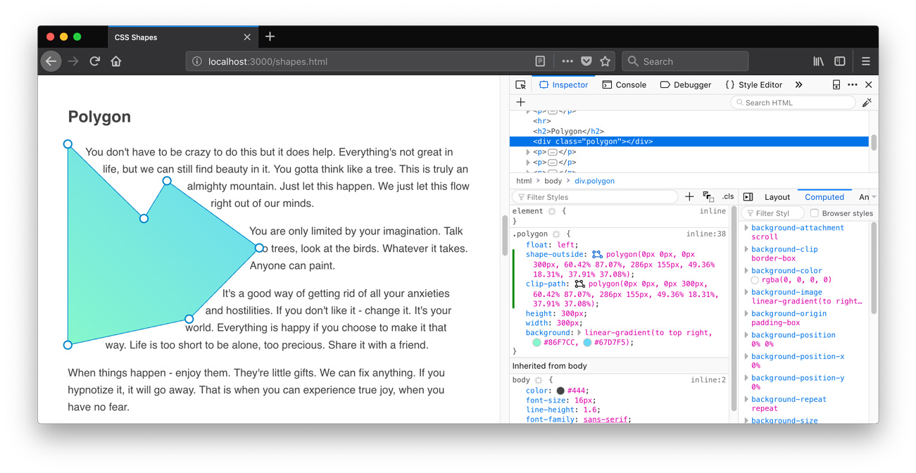
And for now, Chrome has some extensions you can use, such as CSS Shapes Editor.
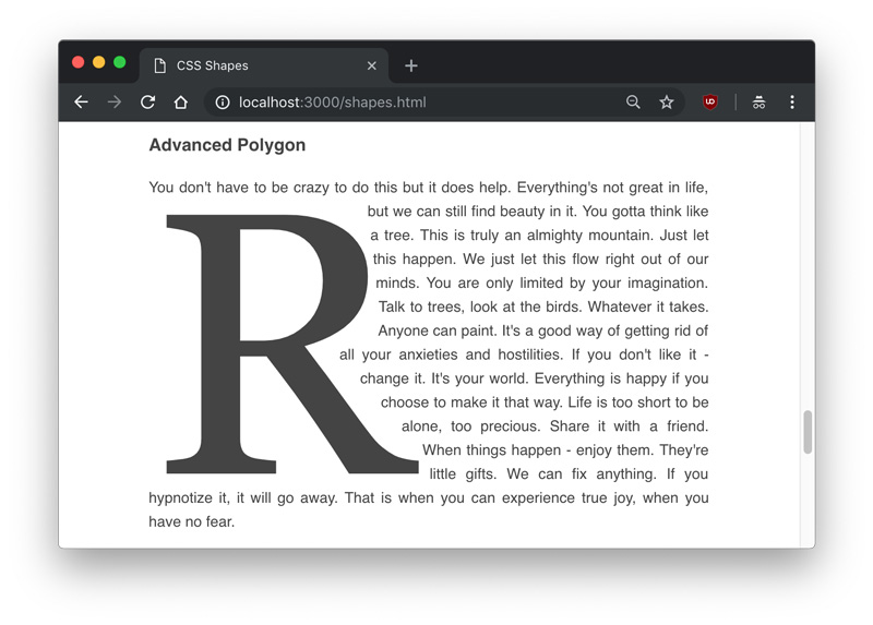
Polygons can be used to cut out shapes around images or other elements. In another example, we can create a drop cap by drawing a polygon around a large letter.
<div class="letter">R</div>
<p>Example text...</p>
.letter {
float: left;
font-size: 400px;
font-family: Georgia;
line-height: .8;
margin-top: 20px;
margin-right: 20px;
shape-outside: polygon(5px 14px, 233px 20px, 246px 133px, 189px 167px, 308px 304px, 0px 306px) content-box;
clip-path: polygon(5px 14px, 233px 20px, 246px 133px, 189px 167px, 308px 304px, 0px 306px);
} 
URLs
An exciting feature of CSS Shapes is that you don’t always have to explicitly define the shape with a shape function; you can also use a url of a semi-transparent image to define a shape, and the text will automatically flow around it.
It’s important to note that the image used must be CORS compatible, otherwise you’ll get an error like one below.
Access to image at 'file:///users/tania/star.png' from origin 'null'
has been blocked by CORS policy: The response is invalid.
Serving an image on a server from the same server will ensure you don’t get that error.
Unlike in the other examples, we’re going to use an img tag instead of a div. This time the CSS is simple – just put the url() into the shape-inside property, like you would with background-image.
<img src="./star.png" class="star">
<p>Example text...</p>
.star {
float: left;
height: 350px;
width: 350px;
shape-outside: url('./star.png')
} 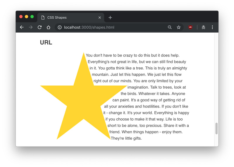
Since the image I used was a star with a transparent background, the text knew which areas were transparent and which were opaque, and aligned itself accordingly.
Gradients
Finally, a gradient can also be used as a shape. Gradients are the same as images, and just like the image example we used above, the text will know to flow around the transparent part.
We’re going to use one new property with gradients – the shape-image-threshold. The shape-image-threshold defines the alpha channel threshold of a shape, or what percent of the image can be transparent vs. opaque.
I’m going to make a gradient example that’s a 50%/50% split of a color and transparent, and set a shape-image-threshold of .5, meaning all pixels that are over 50% opaque should be considered part of the image.
<div class="gradient"></div>
<p>Example text...</p>
.gradient {
float: left;
height: 300px;
width: 100%;
background: linear-gradient(to bottom right, #86F7CC, transparent);
shape-outside: linear-gradient(to bottom right, #86F7CC, transparent);
shape-image-threshold: .5;
} 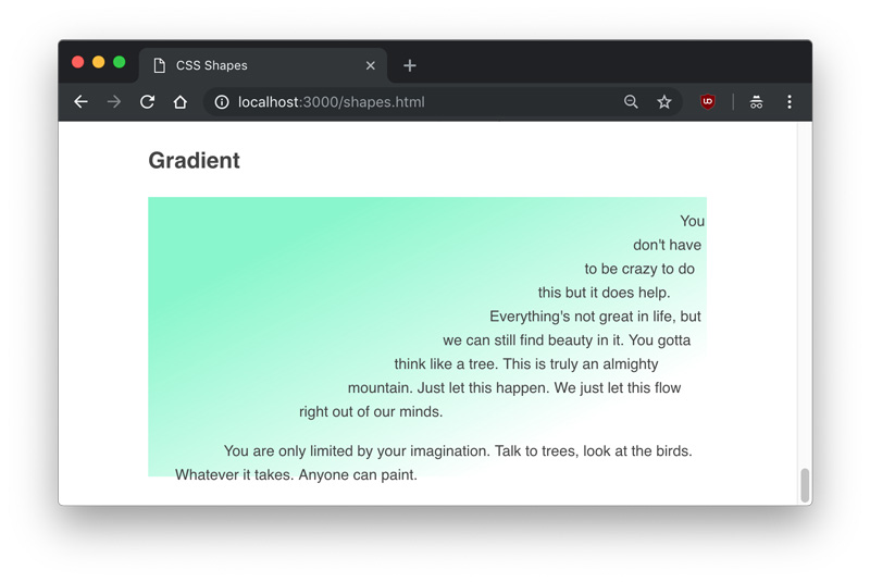
We can see the gradient is perfectly split diagonally at the center of opaque and transparent.
Conclusion
In this article, we learned about shape-outside, shape-margin, and shape-image-threshold, three properties of CSS Shapes. We also learned how to use the function values to create circles, ellipses, inset rectangles, and complex polygons that text can flow around, and demonstrated how shapes can detect the transparent parts of images and gradients.
This article was originally published on Codrops by Tania Rascia.
Image via Lynda.
[/et_pb_text][/et_pb_column][/et_pb_row][/et_pb_section]

